Uplift by Brew Dr.
Energy-Infused Goodness
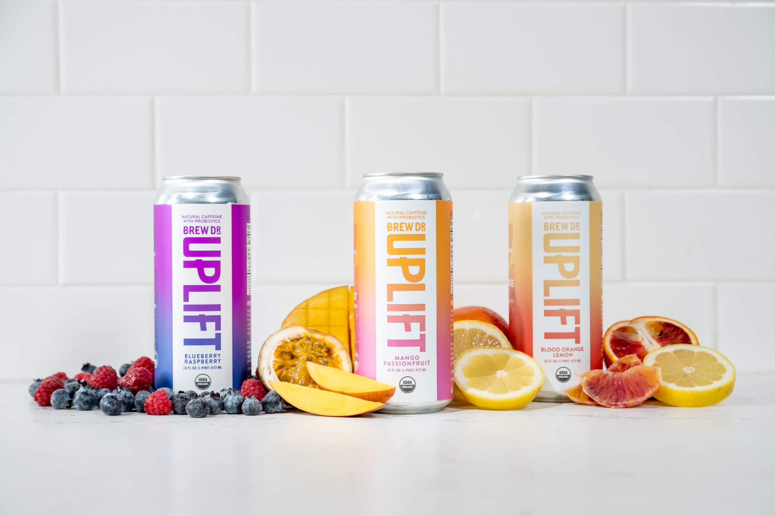
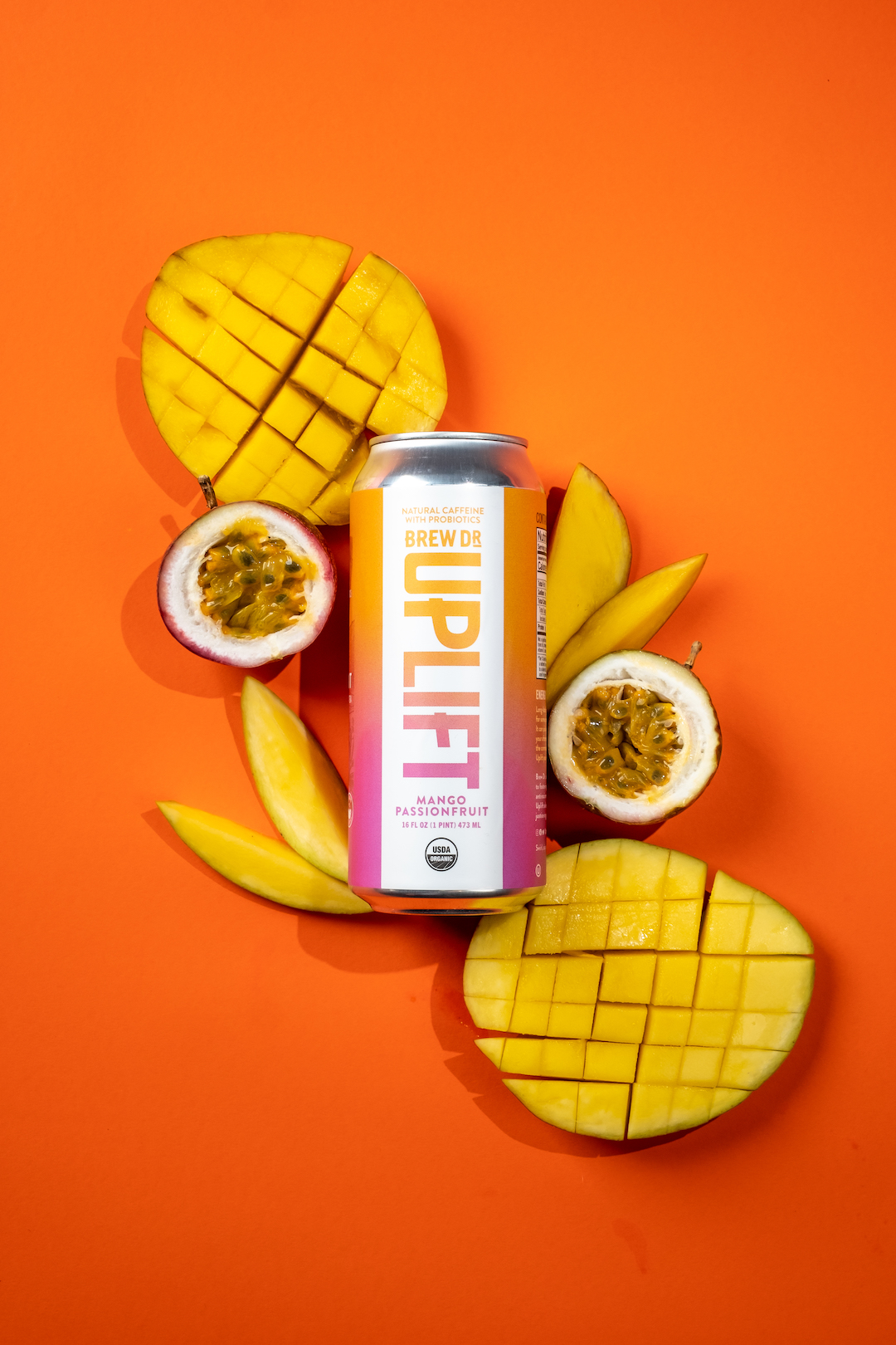
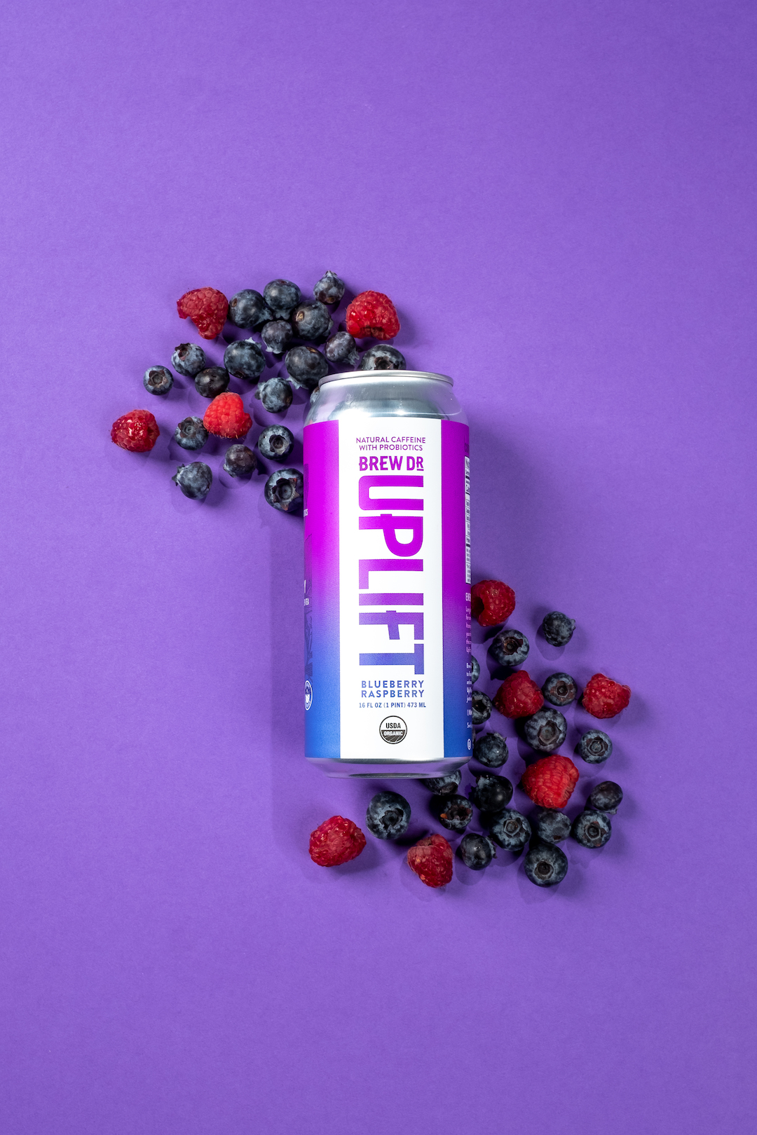
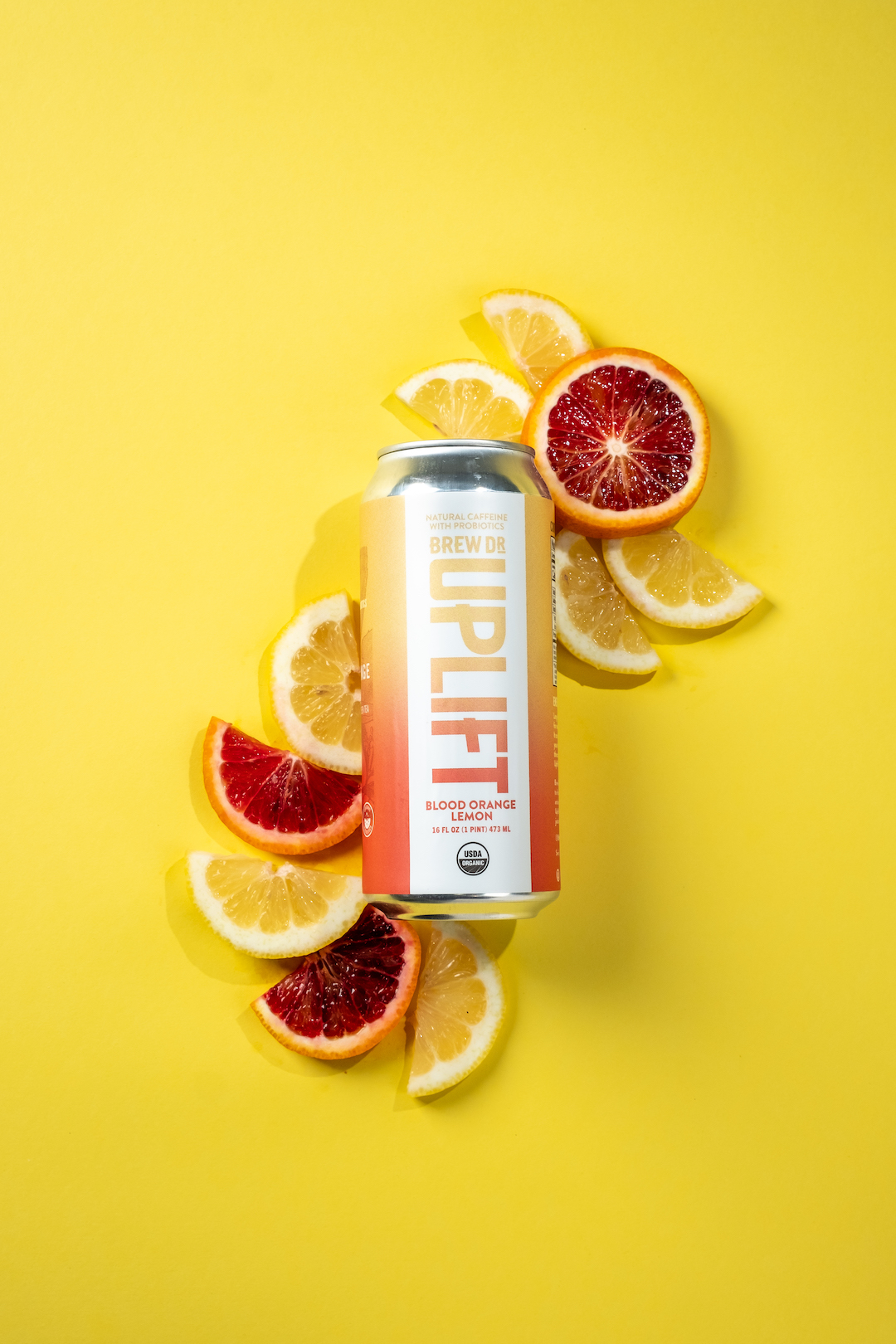
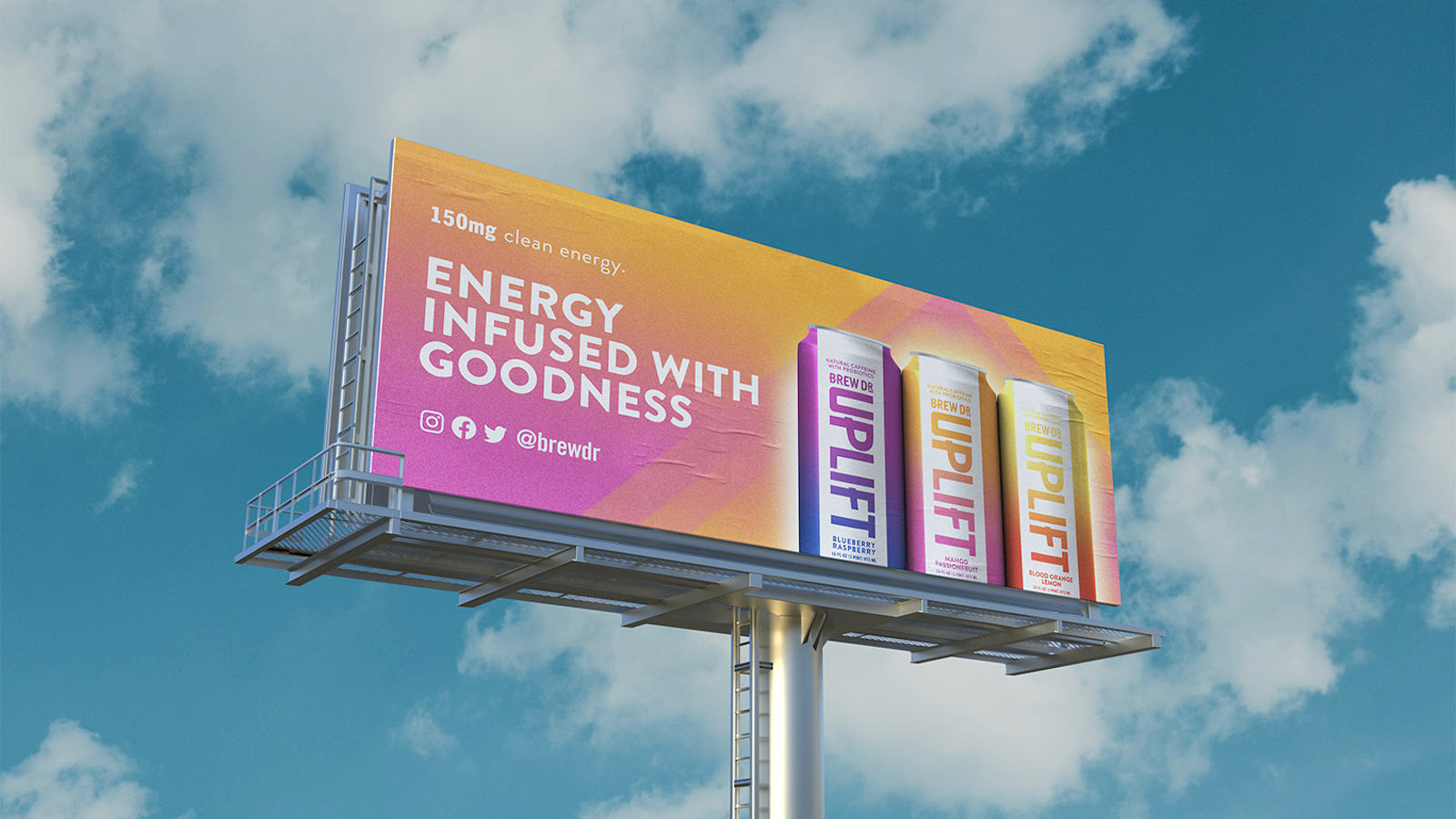
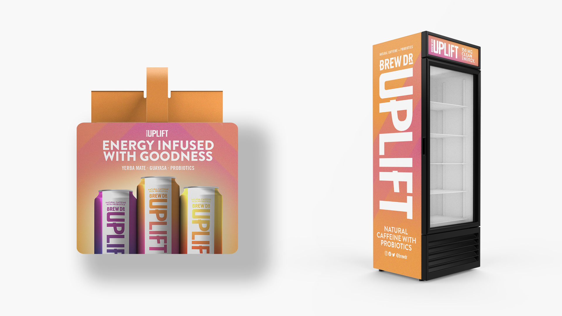
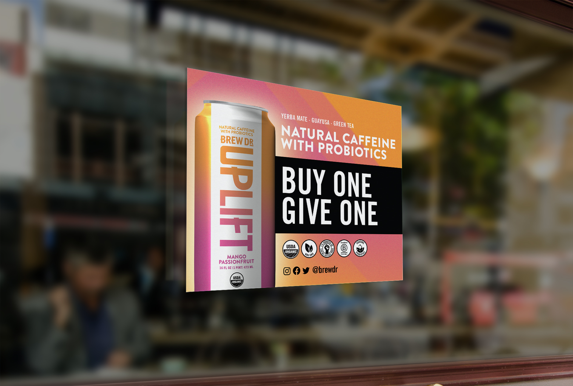
Uplift yourself, Uplift your world. We worked with Brew Dr. to revamp their Uplift packaging and create a fresh identity for their brand. This natural energy drink is not only good for you, but good for the planet. 1% of every purchase goes to social justice programs. From color gradients to natural illustrations and geometric shapes, we generated a design sure to stand out on the shelves.
Opportunity:
Stand out in a densely populated and negative-energy market by showcasing the brand’s commitment to community and the thoughtful, positive-impact design behind each purchase.
Approach:
Inspiring copy and new, electric branding highlighted Uplift’s positive energy, giving consumers a boost of warm emotions in every sip.
Result:
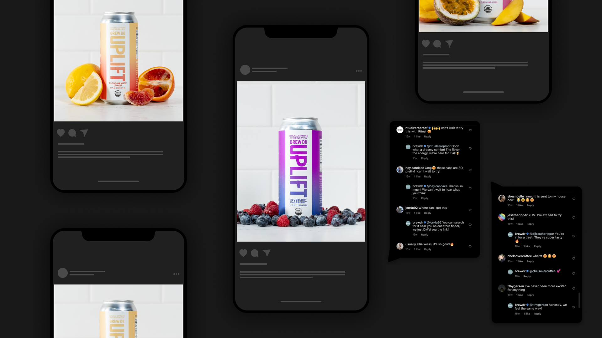
Wow, did it pop on the shelf! A revamp that wasn’t just a hit in stores but also on social media. Boosted engagements and positive comments flooded in from the client, shoppers, and the design community alike.
