UKANDU
A Place to Be U
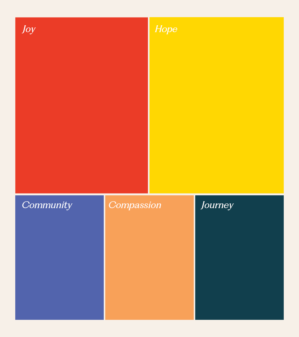
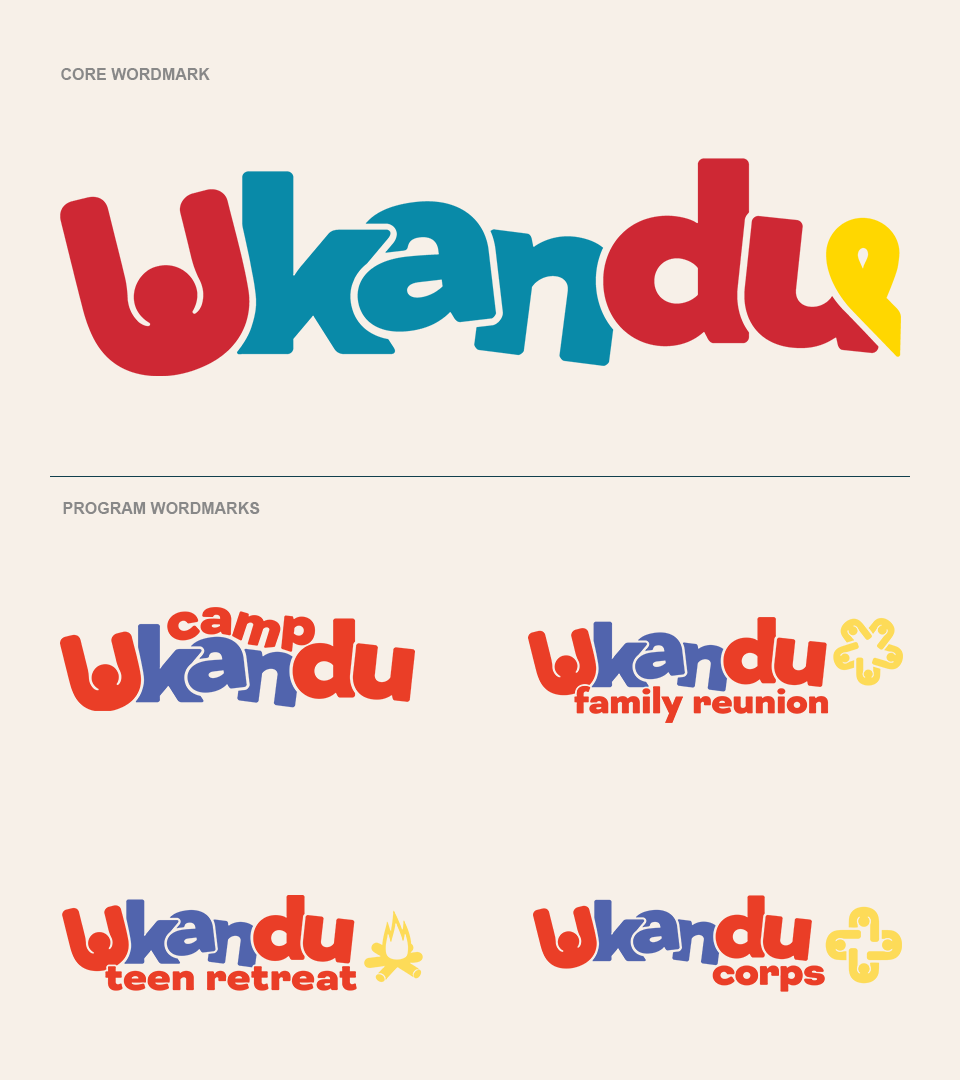
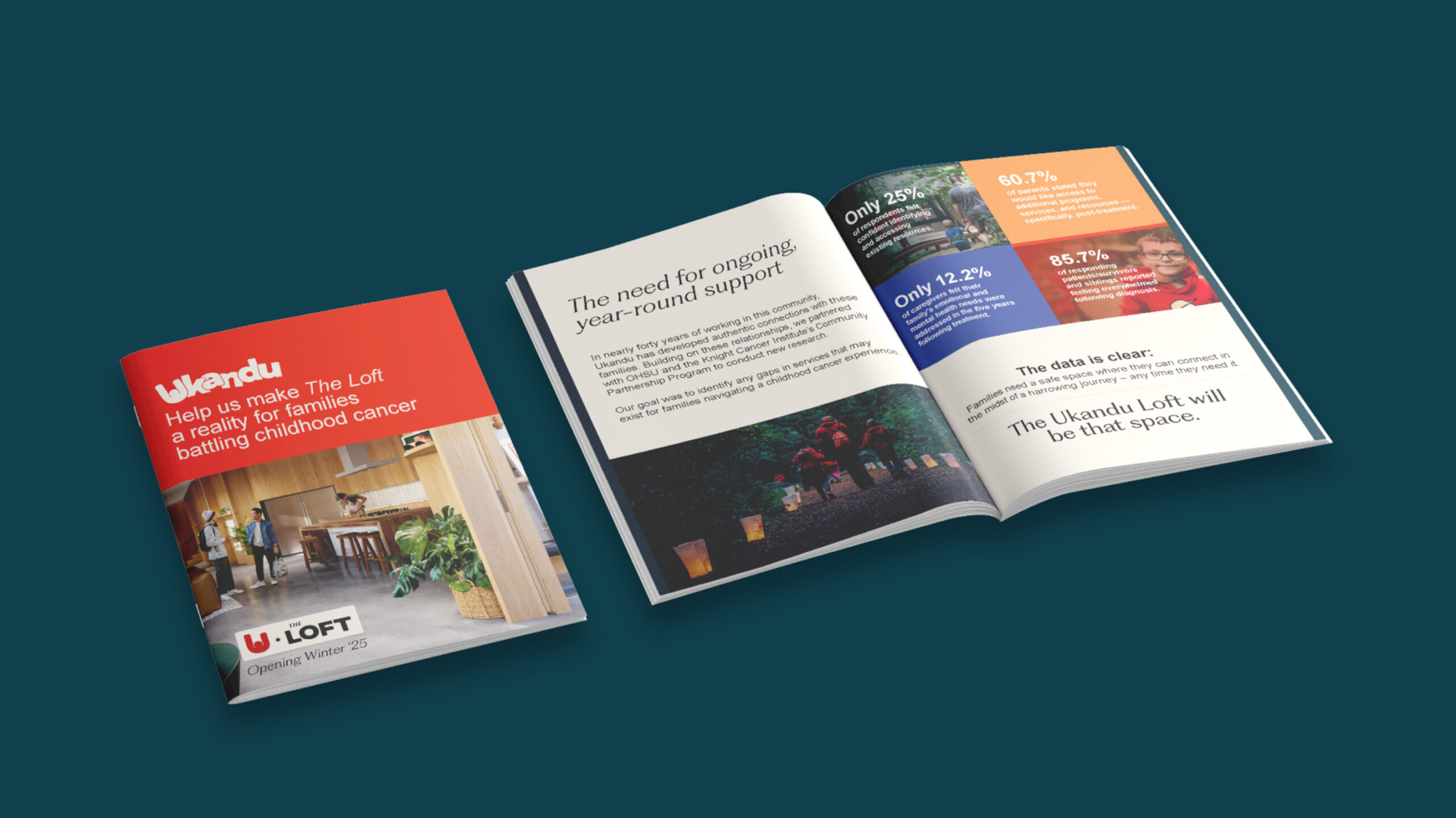
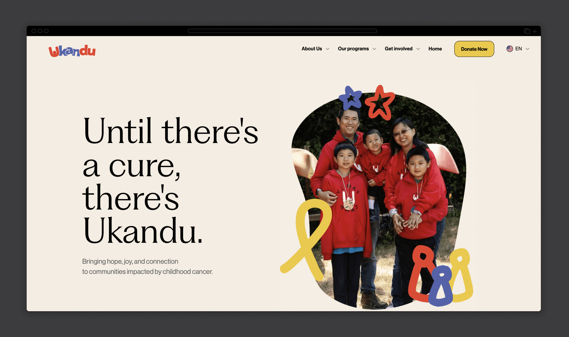
We gave Ukandu a full rebrand that reflects the full spectrum of what they offer – joy, care, community, and support for families navigating the childhood cancer journey.
Opportunity
Supporting families dealing with childhood cancer requires so much more than medical care. It’s about providing holistic, ongoing emotional and community support whenever they need it. Ukandu has been holding it down for families with with camps, year-round programming and other support, yet their brand needed a refresh to better reflect the depth of care and resilience they offer throughout the entire cancer journey.
Insight
In our research, we found that families affected by childhood cancer often struggle with a sense of isolation and a lack of long-term emotional support outside the hospital setting. They needed a place where they could be themselves—whether they’re laughing, crying, or just needing a break. They also craved connection with people who truly understand their experience.
This gave us a clear direction: Ukandu’s new brand had to feel like a sanctuary—a place where families could come as they are, for whatever they need, whenever they need it.
Approach
We built the new Ukandu brand around the idea that it’s
“A Place to Be U,” reinforcing that it’s a safe, welcoming space for families going through all stages of the cancer journey. From the highs to the lows, Ukandu is there, like a trusted friend, ready to offer support however it’s needed.
“A Place to Be U,” reinforcing that it’s a safe, welcoming space for families going through all stages of the cancer journey. From the highs to the lows, Ukandu is there, like a trusted friend, ready to offer support however it’s needed.
We honed in on four core pillars: meaningful enrichment, building community strength, holistic support for the entire family, and year-round engagement. These foundations of support shaped everything from the tone of voice to the visual identity. Ukandu’s voice is warm, compassionate, and flexible—whether it’s offering a shoulder to cry on or sharing a laugh. The visuals combine bold, vibrant colors and heartwarming photography, capturing both the joy and the challenges these families experience.
Result
The rebranded Ukandu struck a chord. The new look and messaging resonated with families, donors, and volunteers, helping Ukandu show up in the world as the compassionate, holistic partner they’ve always been. With a stronger identity, Ukandu has been able to further deepen their connections, they’ve been working on growing their programs with a new year-round loft space they’re building in downtown Portland (we’re branded that, too) and they’ve continued providing the emotional and community support that makes all the difference for these families with a more aligned vision of who they are and what they’re able to accomplish together.